Jayson Potter
Designer / Developer
Ever since I could get Play-Doh stuck in my nose, I have been fascinated with technology, human interaction, and the creative process.
Process
-
Empathize
Understand the human needs.
-
Determine
Define the obstacles.
-
Interpret
Generate ideas for solutions.
-
Prototype
Get hands-on.
-
Test
Ensure the problem is solved.
-
Repeat
Iterate at any step to satisfaction.
Starbucks
Store Locator
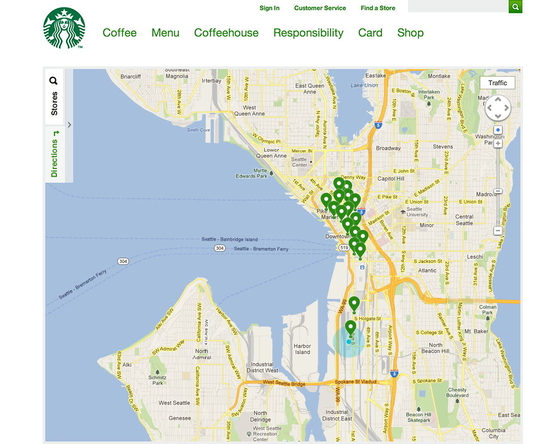
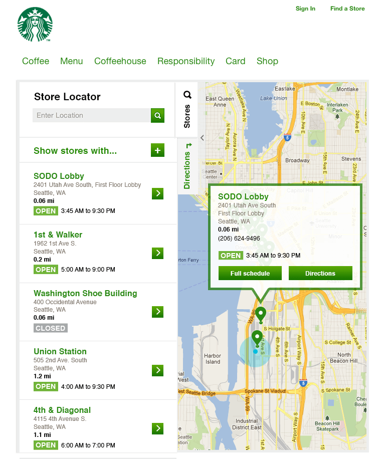
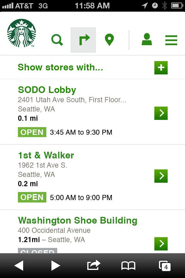
The previously existing store locator was a simple PostBack form. We were pioneering the days of mobile design and application development, and the store locator was a perfect candidate for modernization.
I drove the user experience design, responsiveness, and accessibility. Moving swiftly, I started development right away to lock down the experience and understand our technological restrictions.
Using backbone.js, HTML geolocation, Google Maps API, and a few ARIA roles we were able to deliver a world-class experience locating a Starbucks from anywhere on Earth.
Web Design - Desktop
Web Design - Tablet
Web Design - Mobile
PATH
SharePoint
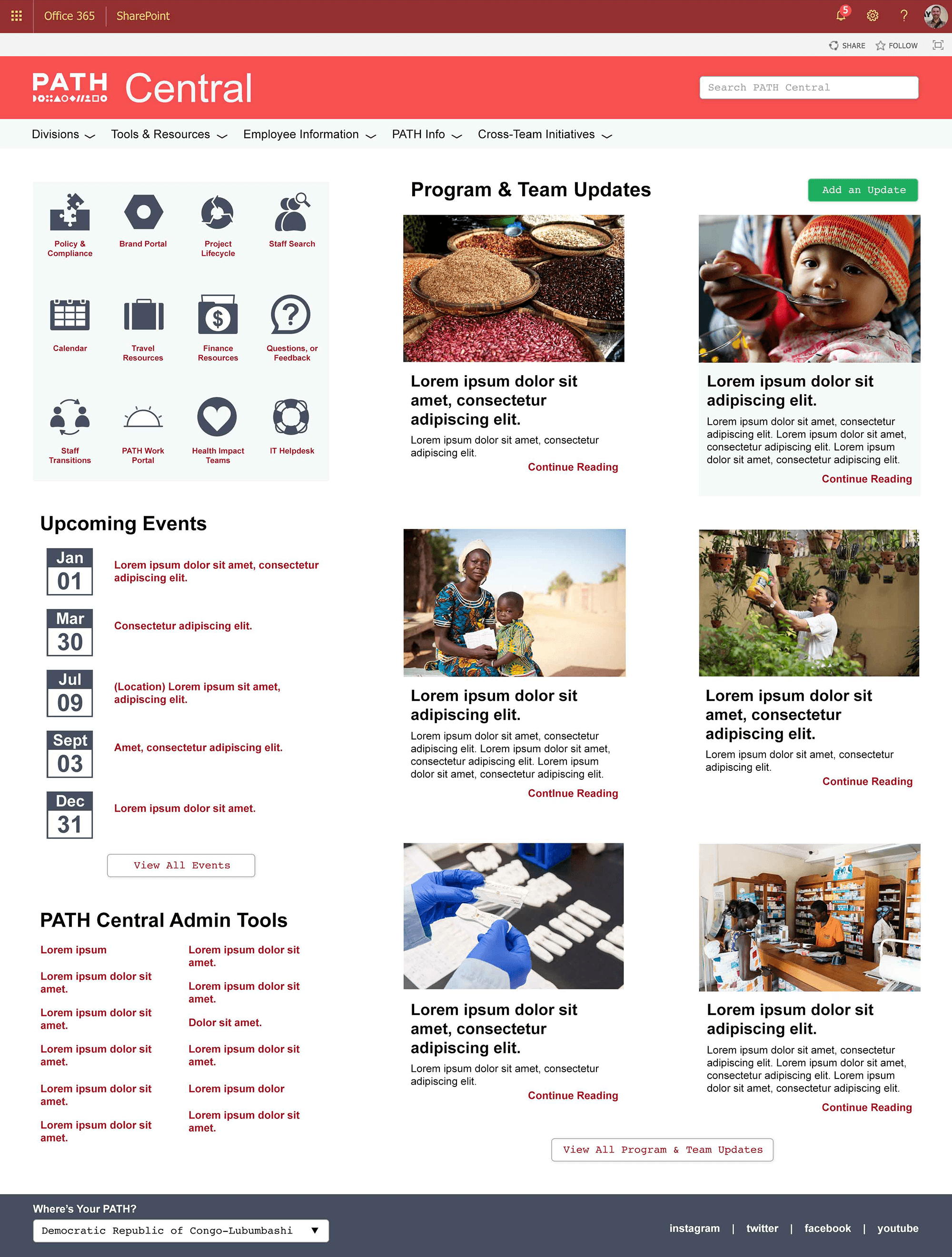
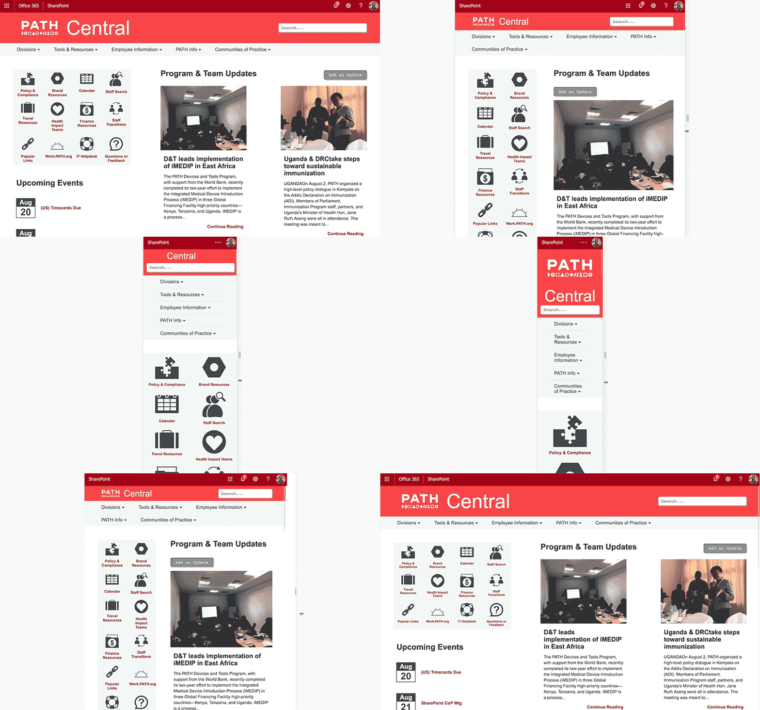
Central, the informational center of the organization, was in dire need of an overhaul. The SharePoint site wouldn't load on mobile devices and was incredibly unresponsive. The visual design and experience felt ignored. There were too many rules to follow to use the tools available, and content would stagnate.
I designed and developed the following with a mobile-first approach and melted the rules away by building them into the application. To save on load time I used vanilla JavaScript, existing tools, and the built-in APIs to gather the data from existing sources.
Web Design
Responsive Demo
ETL Admin Interface
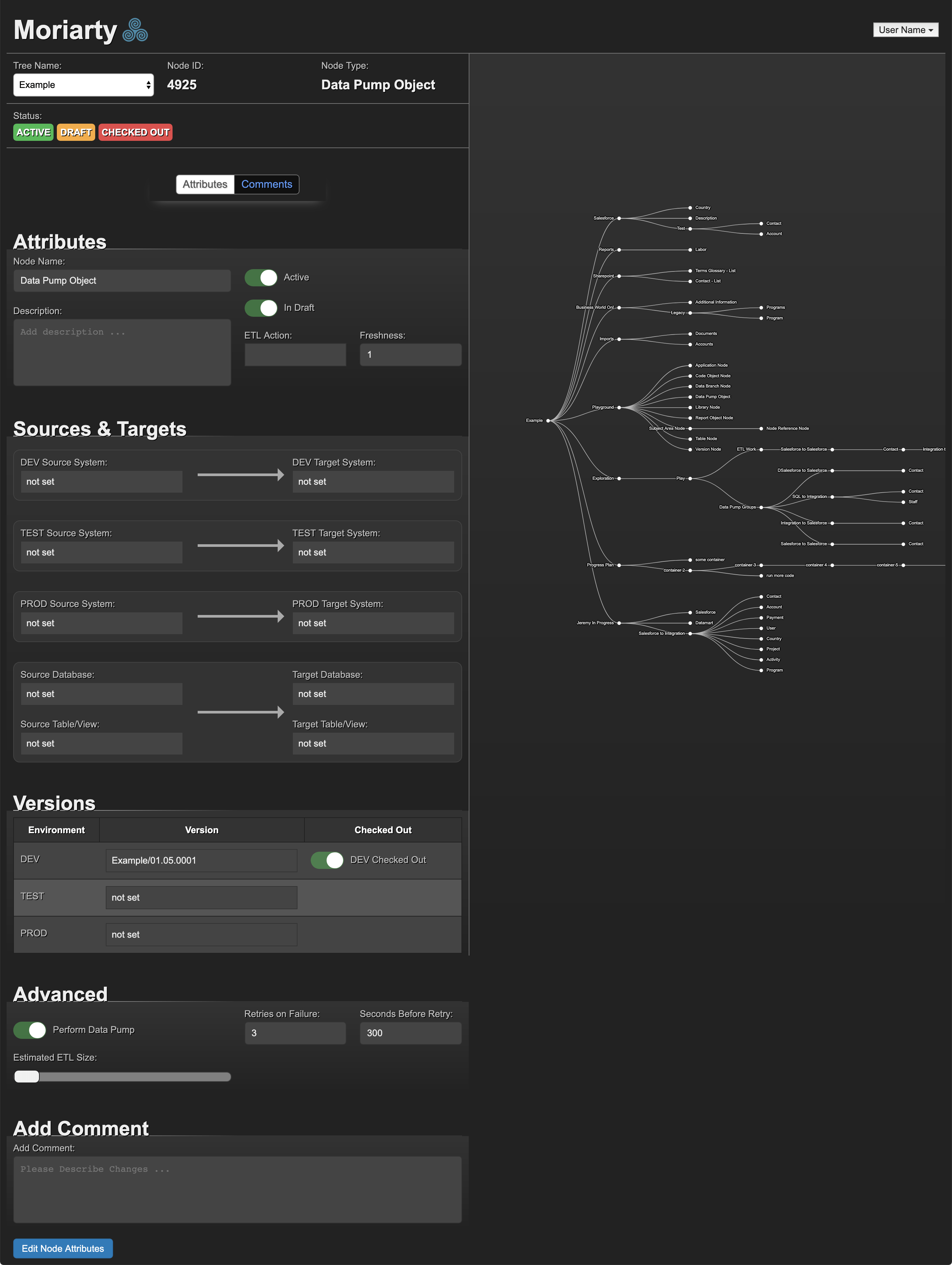
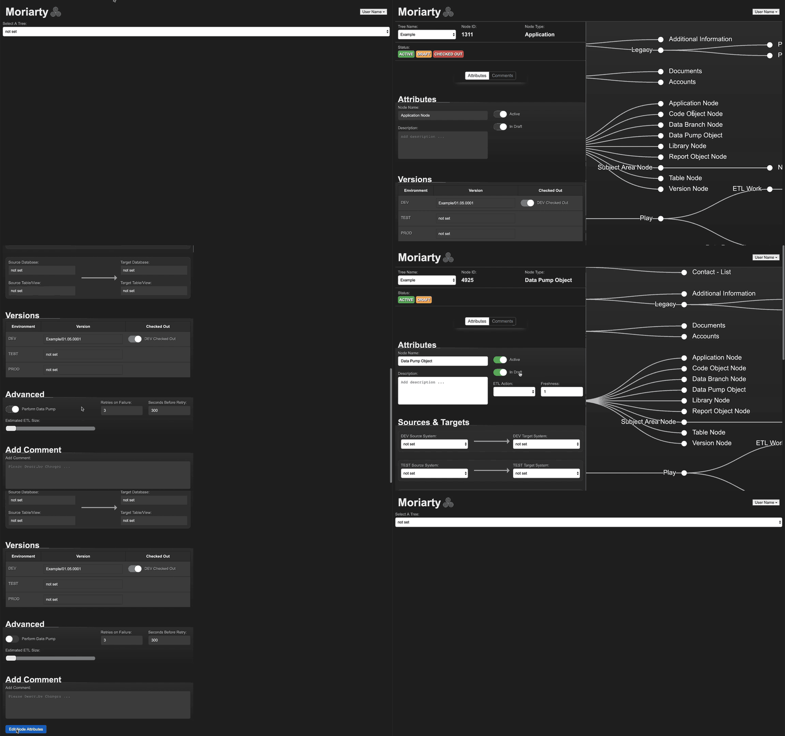
Originally showcased at the NetHope conference in 2017, this was an interface I designed and developed using backbone.js and D3.js.
Based off the needs I gathered from the administrator and author of the ETL engine, I was able to design a solution that exceeded their expectations and streamlined their workflow.
Web Application
Interactivity Demo
Unicorn
Brand Identity
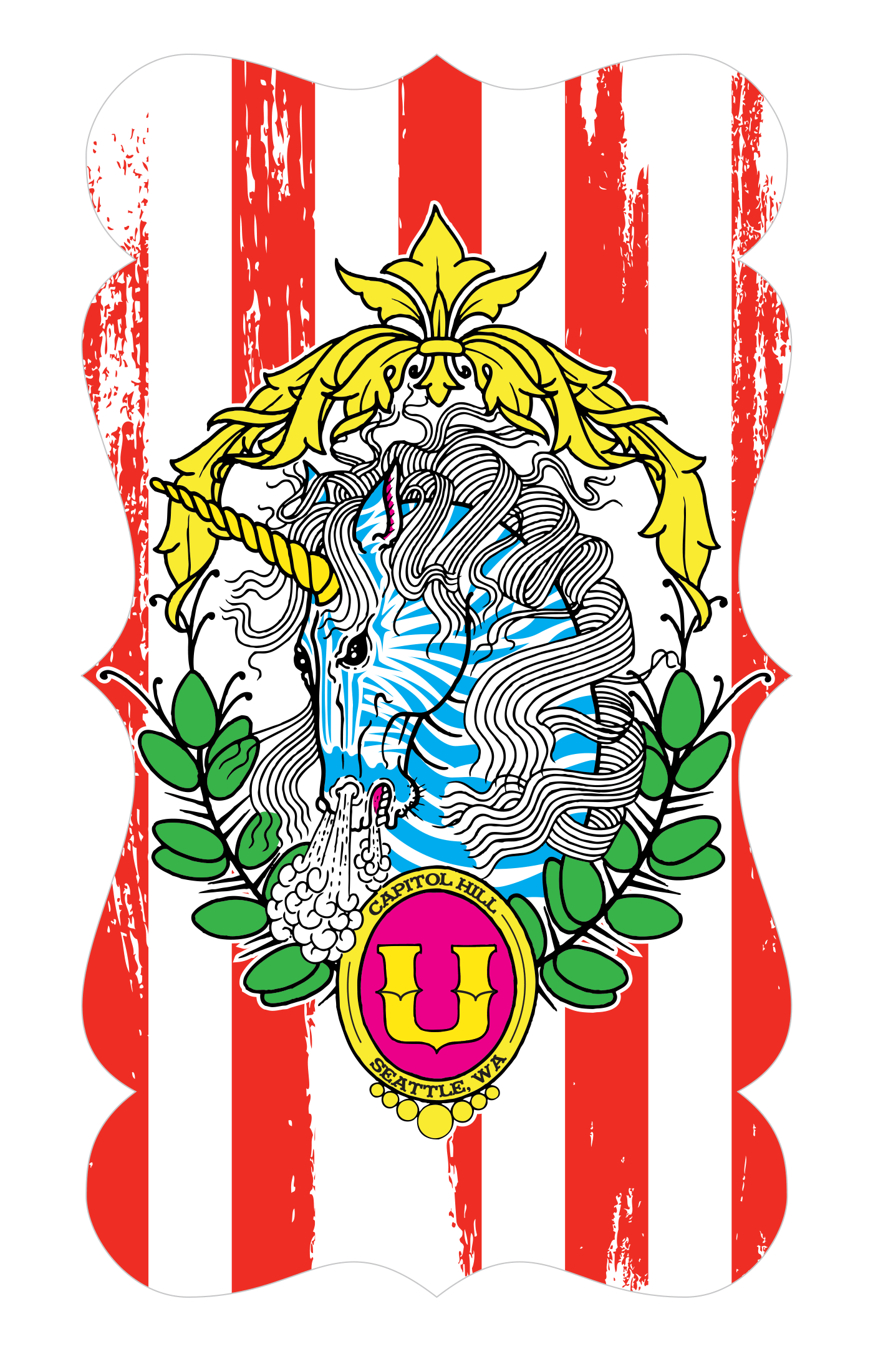
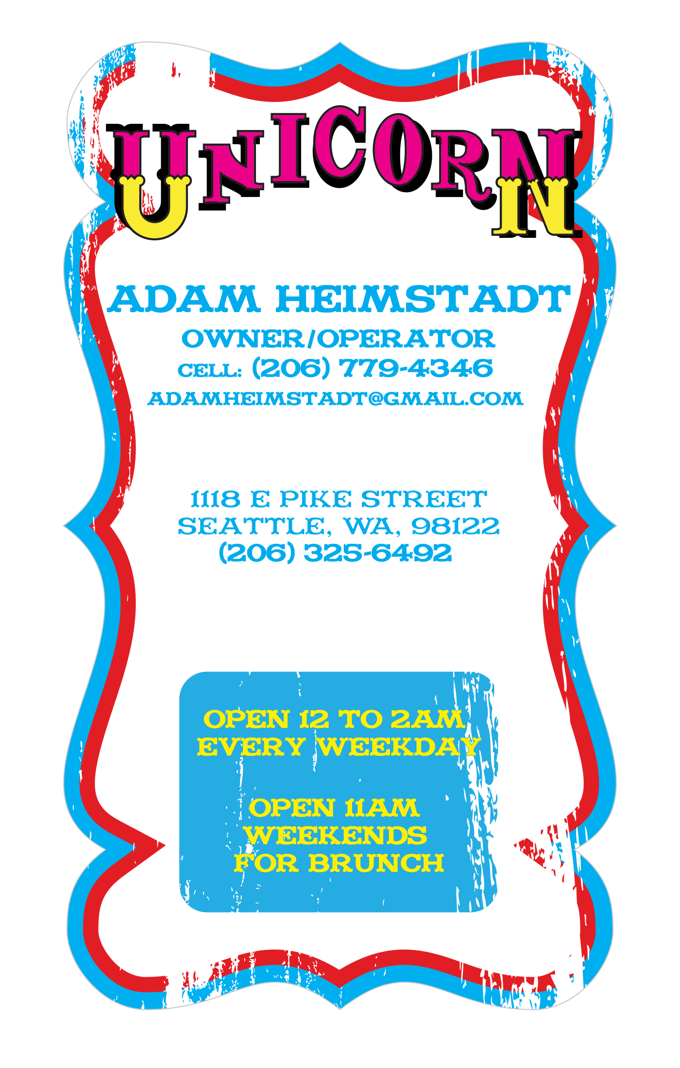
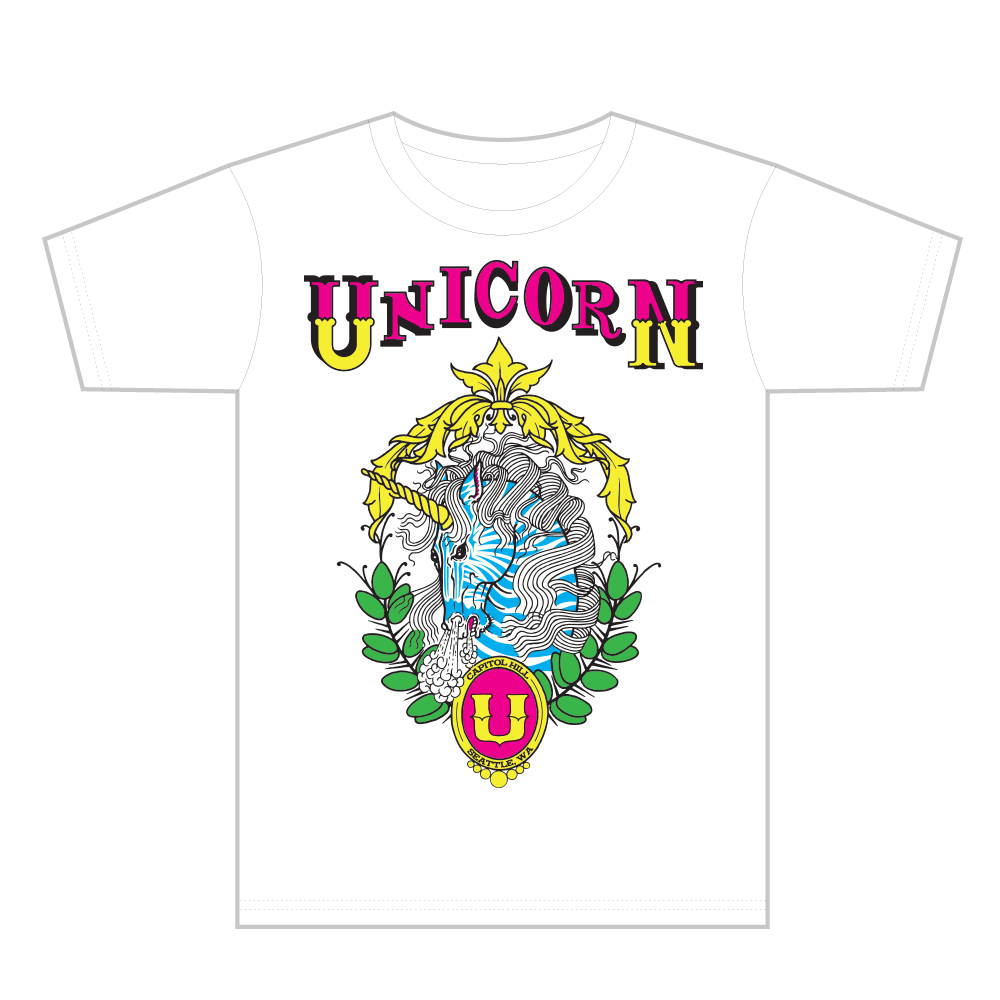
I met the owner of Unicorn through volunteering to paint a circus gorilla on a table while they were getting the place ready to open. Later I was hired to generate digital assets for their branding, business cards, and color separation for printing t-shirts.
I digitized the amazing Unicorn crest from art they provided, and I used their signage outside as the major inspiration for their logo illustration. My design of the die-cut business card was influenced by the establishments interior and the table I had painted. The t-shirts came naturally by combining the crest and logo.

Logo
Business Card
Product Development
T-Shirt
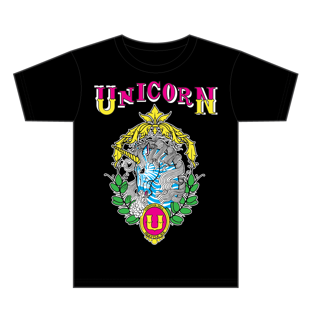
T-Shirt
Mr. Potter's
Brand Identity
I decided to start a small business and needed a logo that exuded handmade.
What I decided on was a slightly modified version of a script font that is reminiscent of hand painted signage.

Logo
Product Development
In reaction to the high prices of oils for hair, body and face, I decided to do some research and come up with my own recipe. It turned out to be so popular and effective that I wanted to share it with everyone.
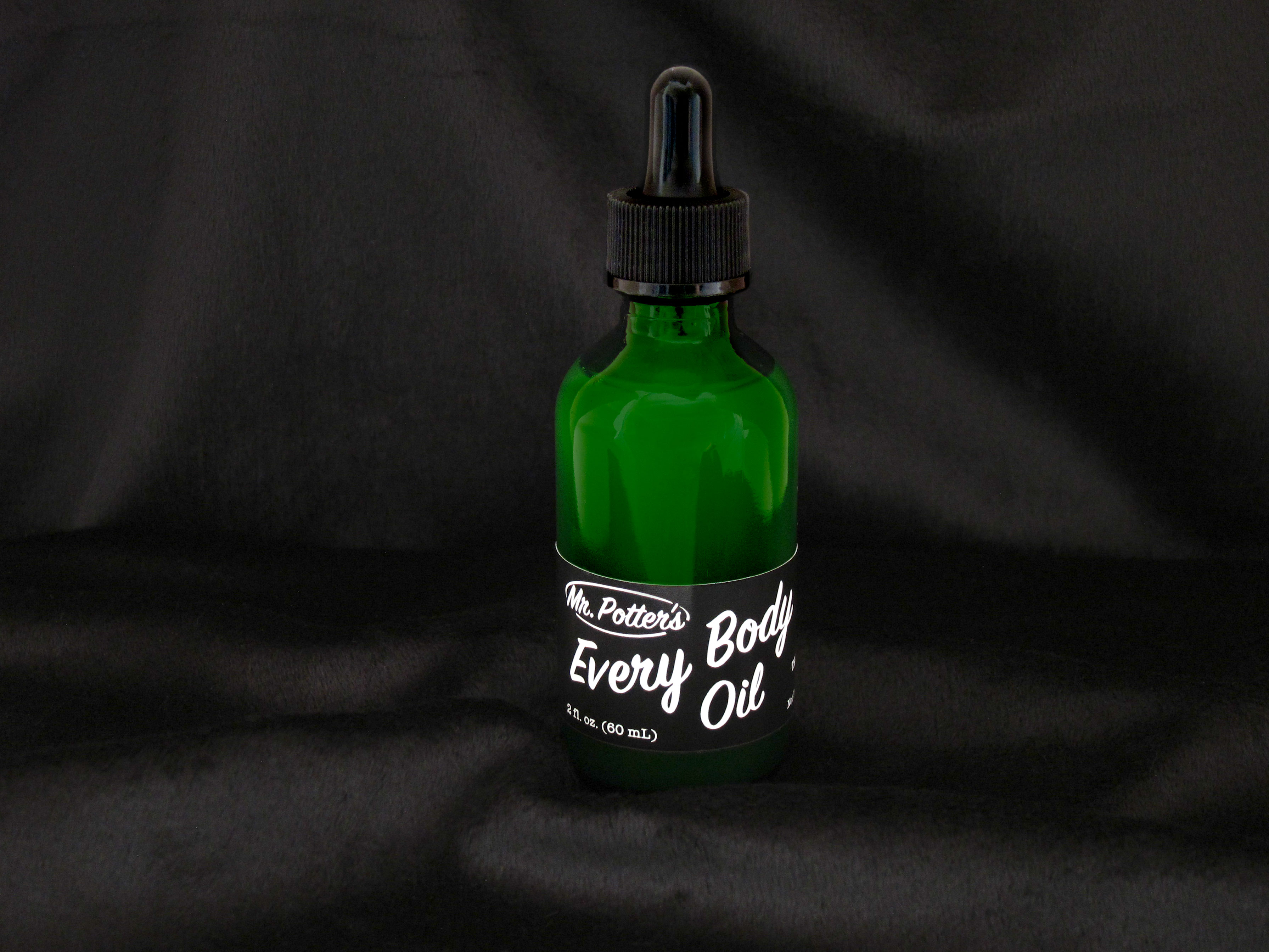
Moisturizing Oil
Rapport Benefits Group
Brand Identity
The client contacted me looking for some options for a logo, business cards, and a letterhead. I provided them a few options to choose from, and I felt best about what they chose because I thought it expressed their mission, benefits and the security they bring. The Benefits in RBG was surrounded and protected by the combination of Rapport and Group.

Logo
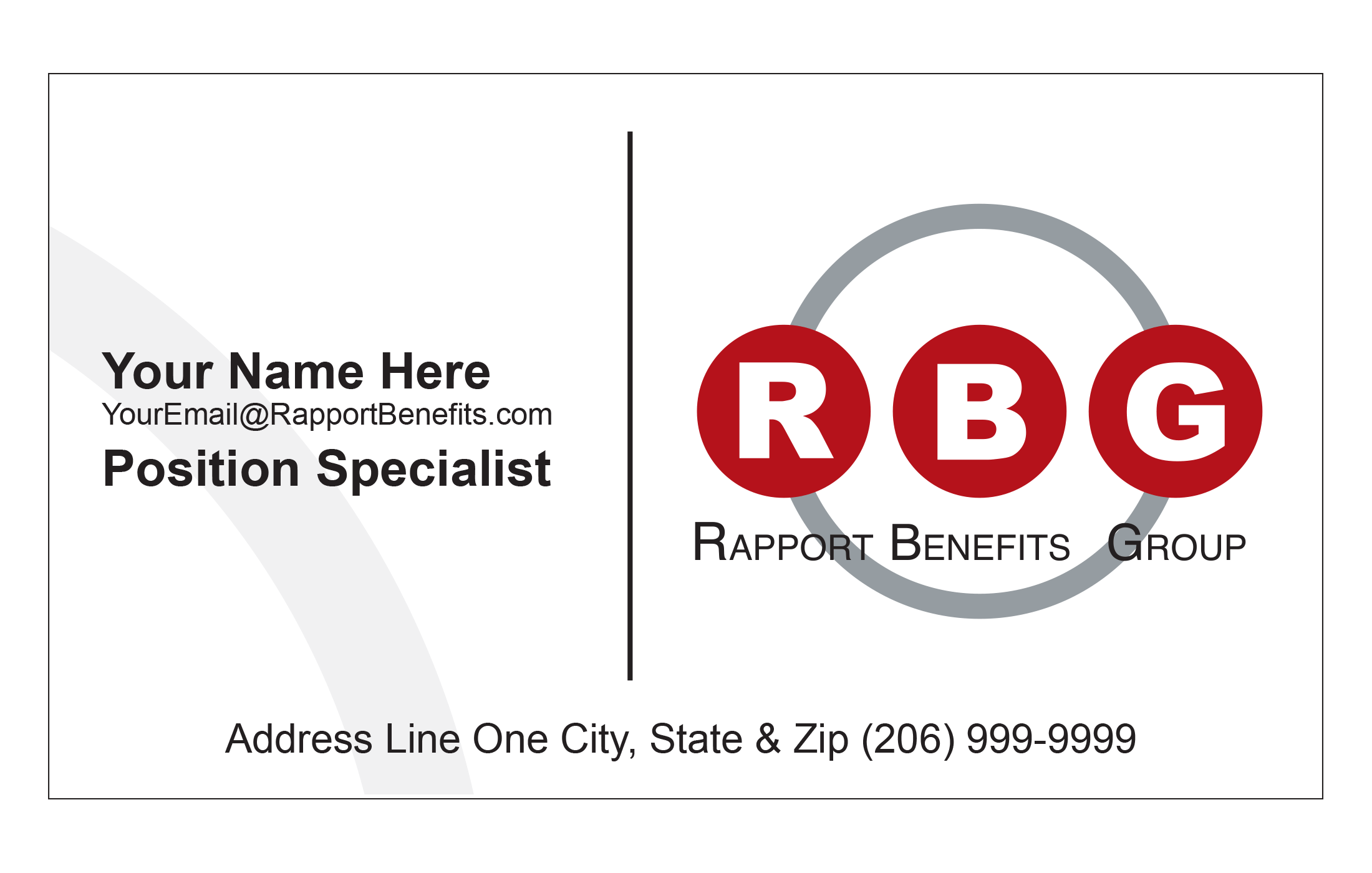
Business Card

Letterhead
ID1 Clothing
Brand Identity
ID1 Clothing needed a look that represented a digital age and progress. Artists and creators of all sorts of disciplines were at the center of the brand. I felt barcodes and QR codes did a great job of really standing out but didn't want to integrate those technologies into the brand itself. What emerged was bold, scalable, and recognizable.

Logo
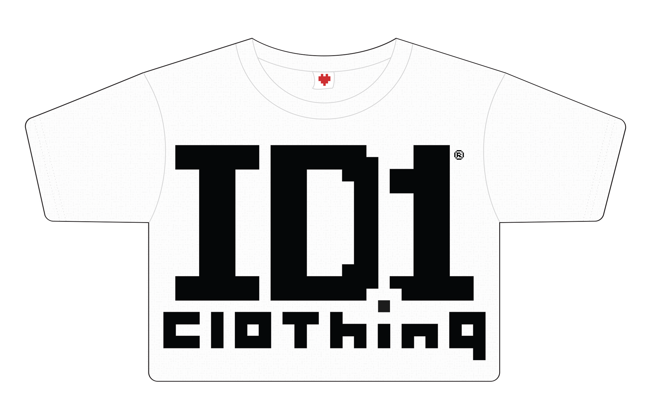
Business Card
Commerce Website
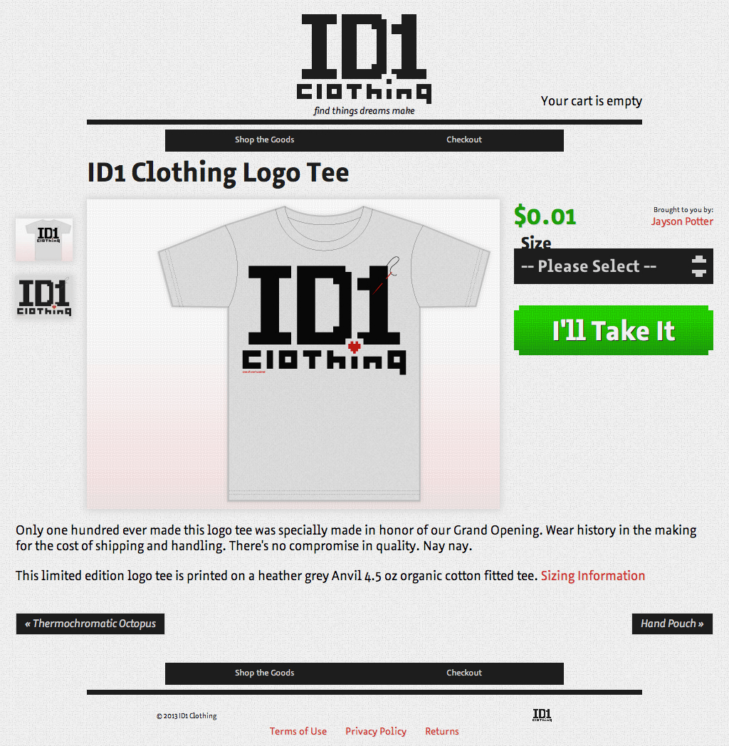
Built using WordPress and wp-ecommerce, the website needed to reflect that next-level experience while drawing focus on the products themselves. It had to be automated and simple to administer while operating as a sole proprietorship.
Web Design
Product Development
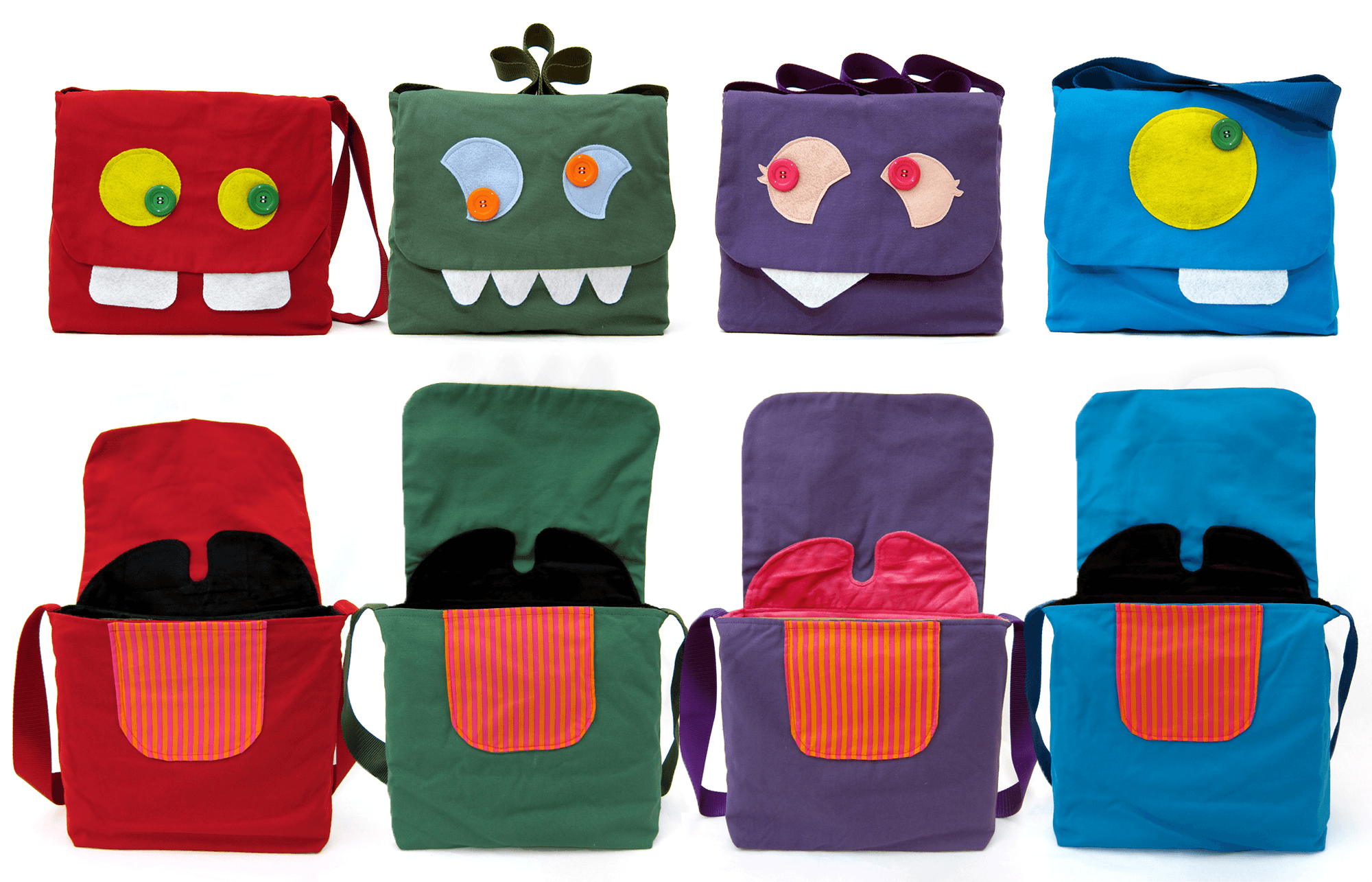
I've developed products like sturdy reusable grocery bags, messenger bags, and wallets from the ground up. I've worked with American manufactures to produce custom made goods and understand that process very well. Below are some examples of my designs.
Messenger Bags
T-Shirt
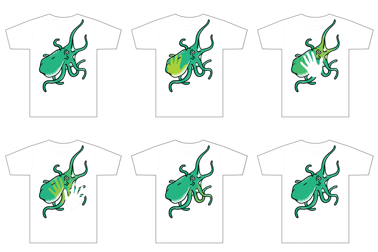
Thermochromatic T-Shirt
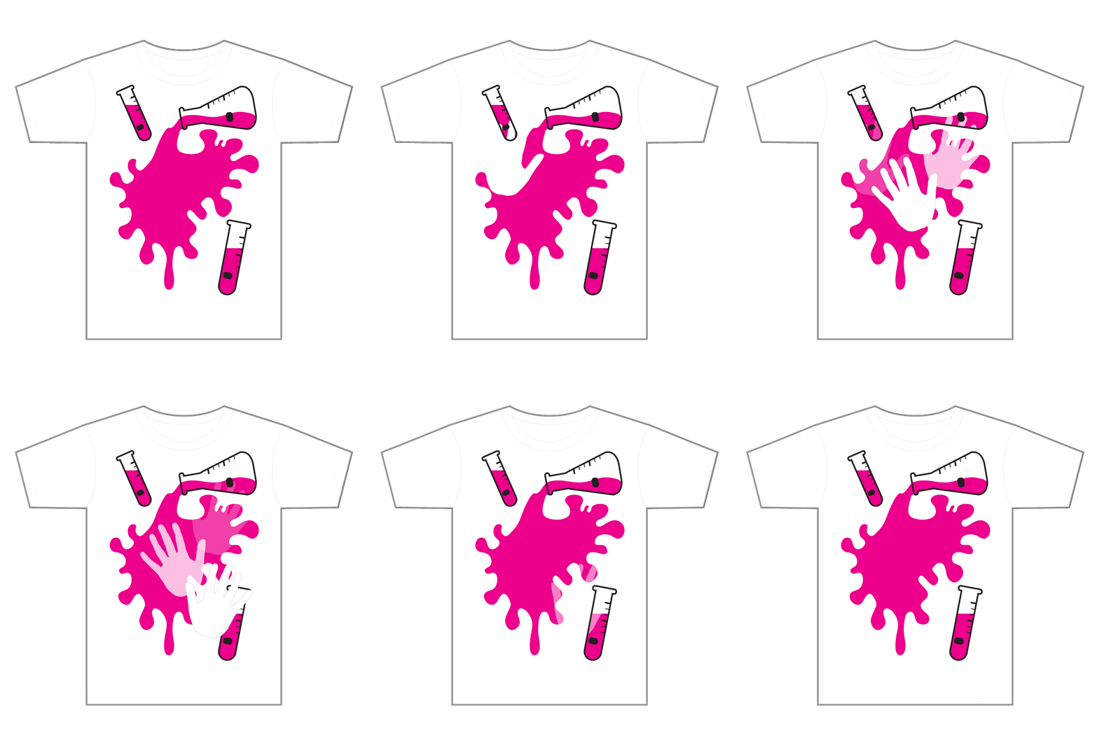
Thermochromatic T-Shirt
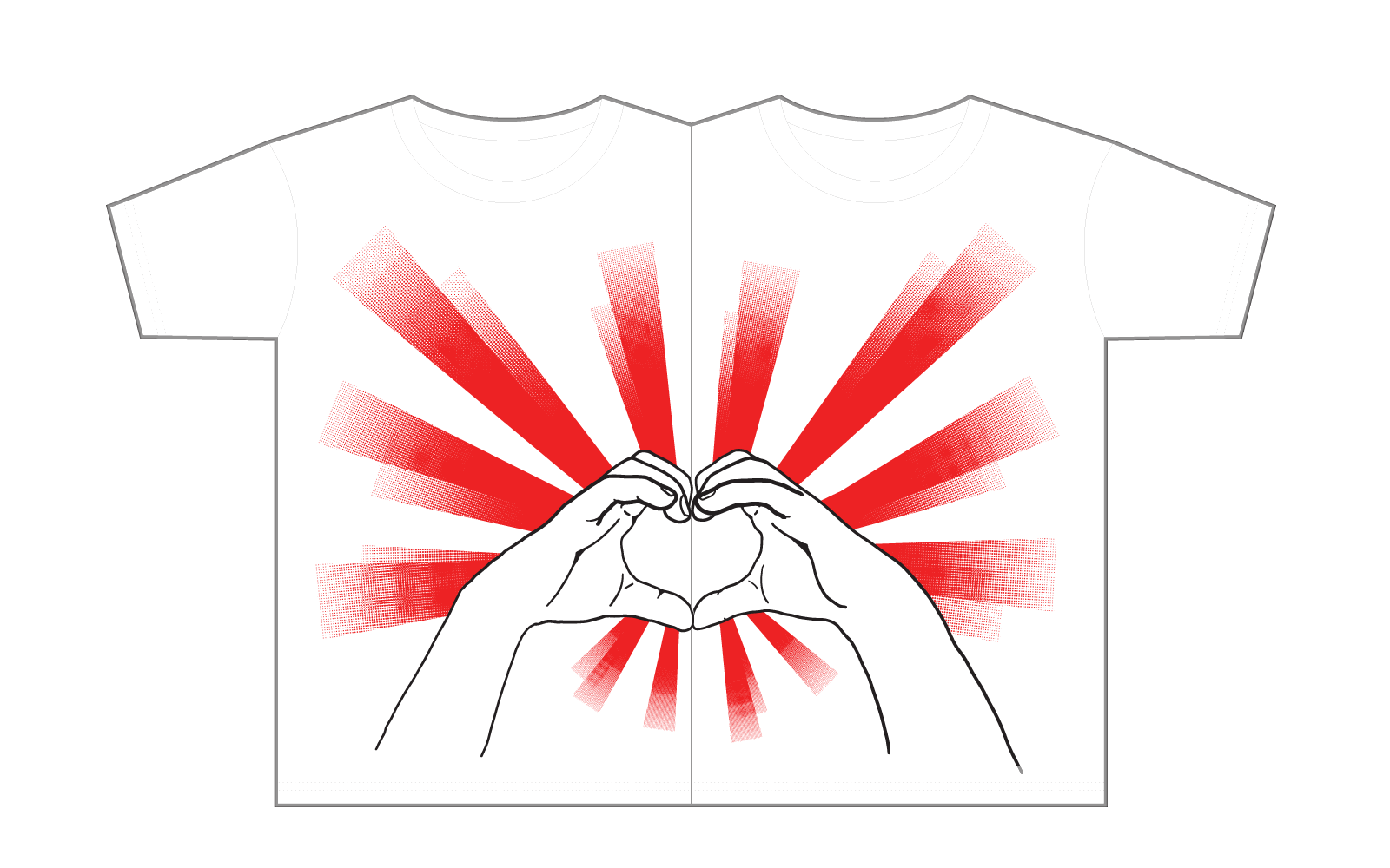
Combo T-Shirts
Promotional
To celebrate the grand opening and showcase the featured mavens, I planned an entire fashion show event-extravaganza. Posters, buttons, stickers, and a limited edition shirt were made to hand out as swag at the event.
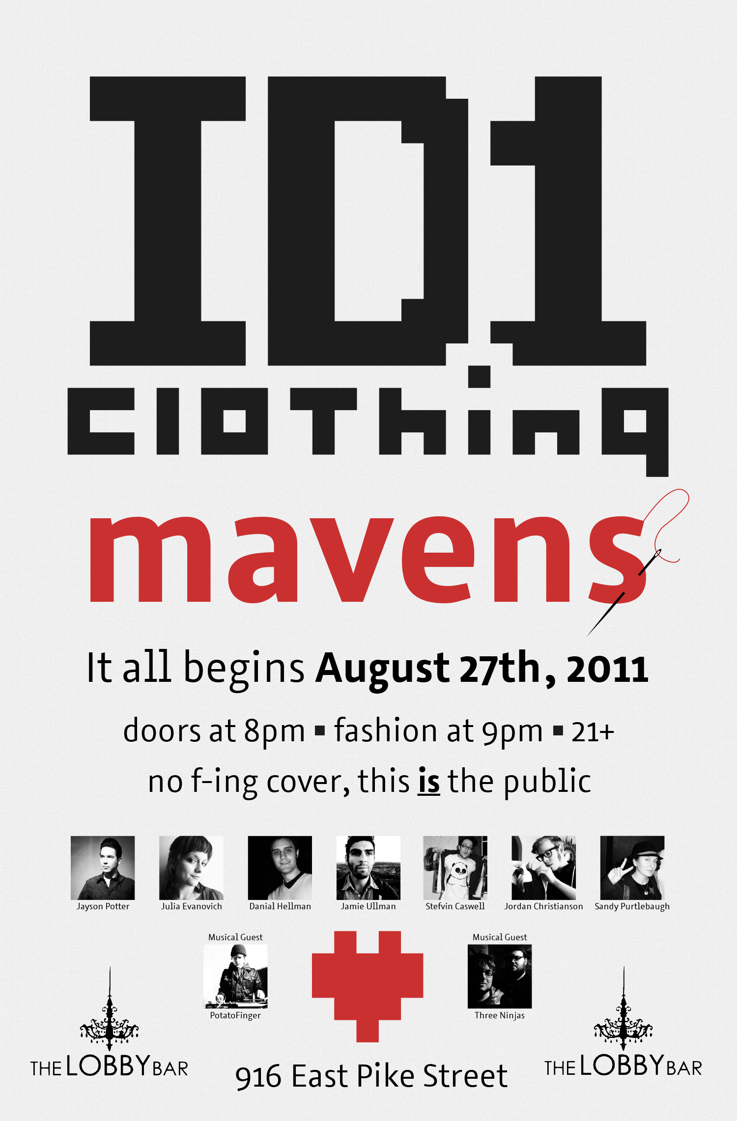
Poster
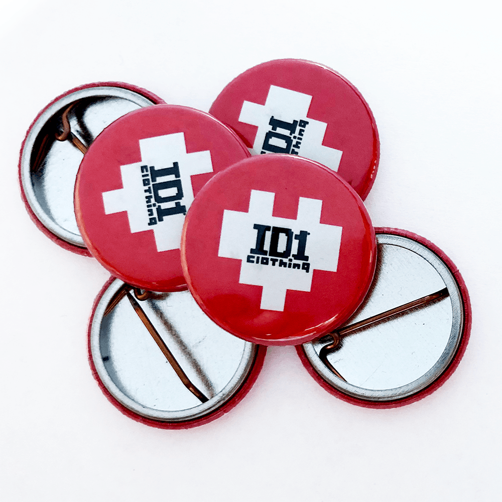
Buttons

Sticker
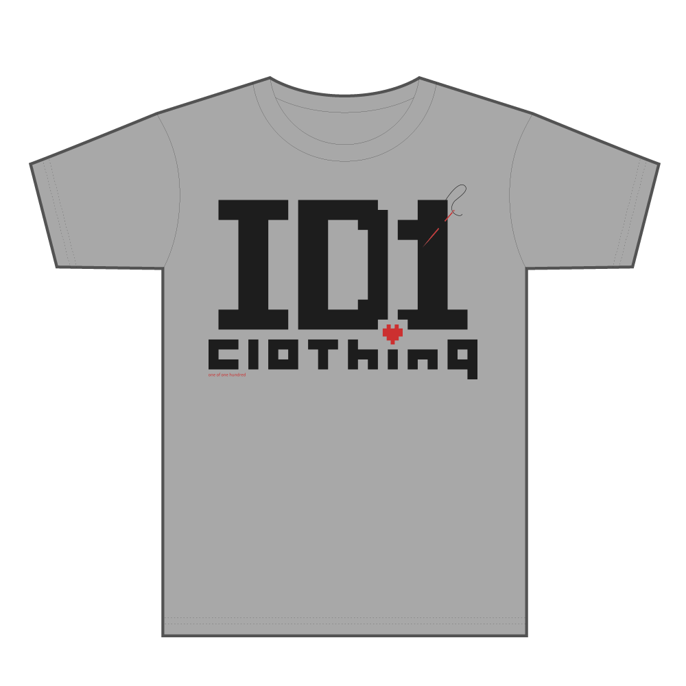
TShirt
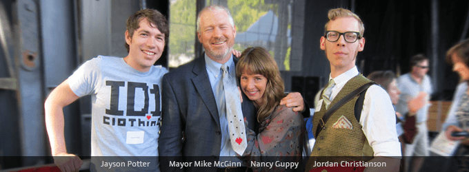
Arts Festival - Presenting Tie to Mayor Mike McGinn
Jason Sharp
Actor Profile Website
Actors have to stand out. This was my way of doing just that by merging realism in the digital space while bringing focus to the headshot, voice reel, and the actor's credits.
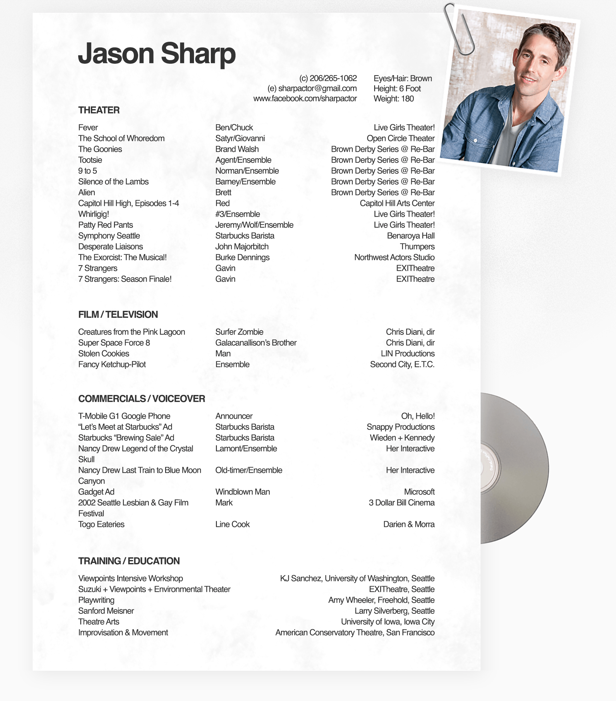
Web Design
Shuttle Express
I had the immense pleasure working with a client who was just about to retire and wanted to leave a mark on their departure by improving the emails sent to clients of Shuttle Express. I was able to provide them with email templates for a few layout options that were easy to modify and rendered properly in email clients.
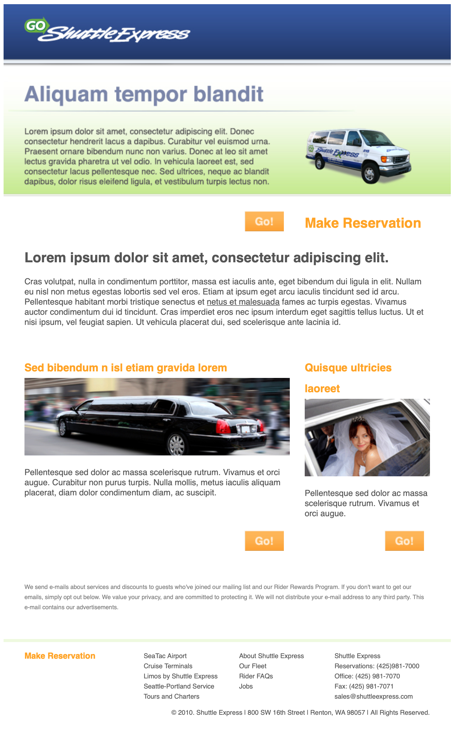
Email Template
Seattle Lesbian & Gay Film Festival
Promotional
Three Dollar Bill Cinema was looking for marketing volunteers. I was given the opportunity to prepare black and white print ads in multiple layouts that were printed in the New York Times, Seattle Times, and several other publications.
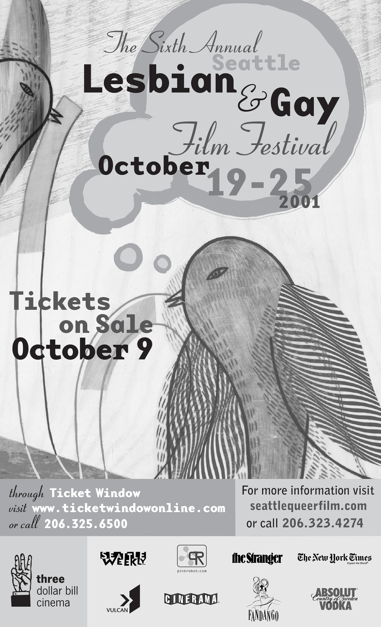
Print Ad
8-bit Theatre Festival
Promotional
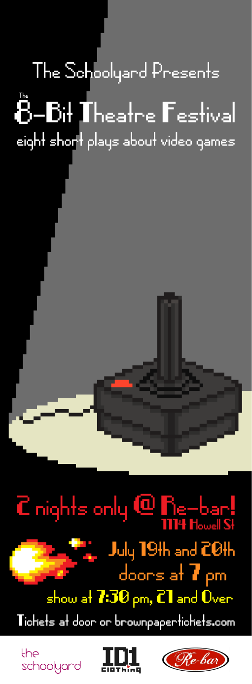
The Schoolyard was in need of poster, print, and web ads for a festival with a theme merging the unlikely pair; video games and theater.
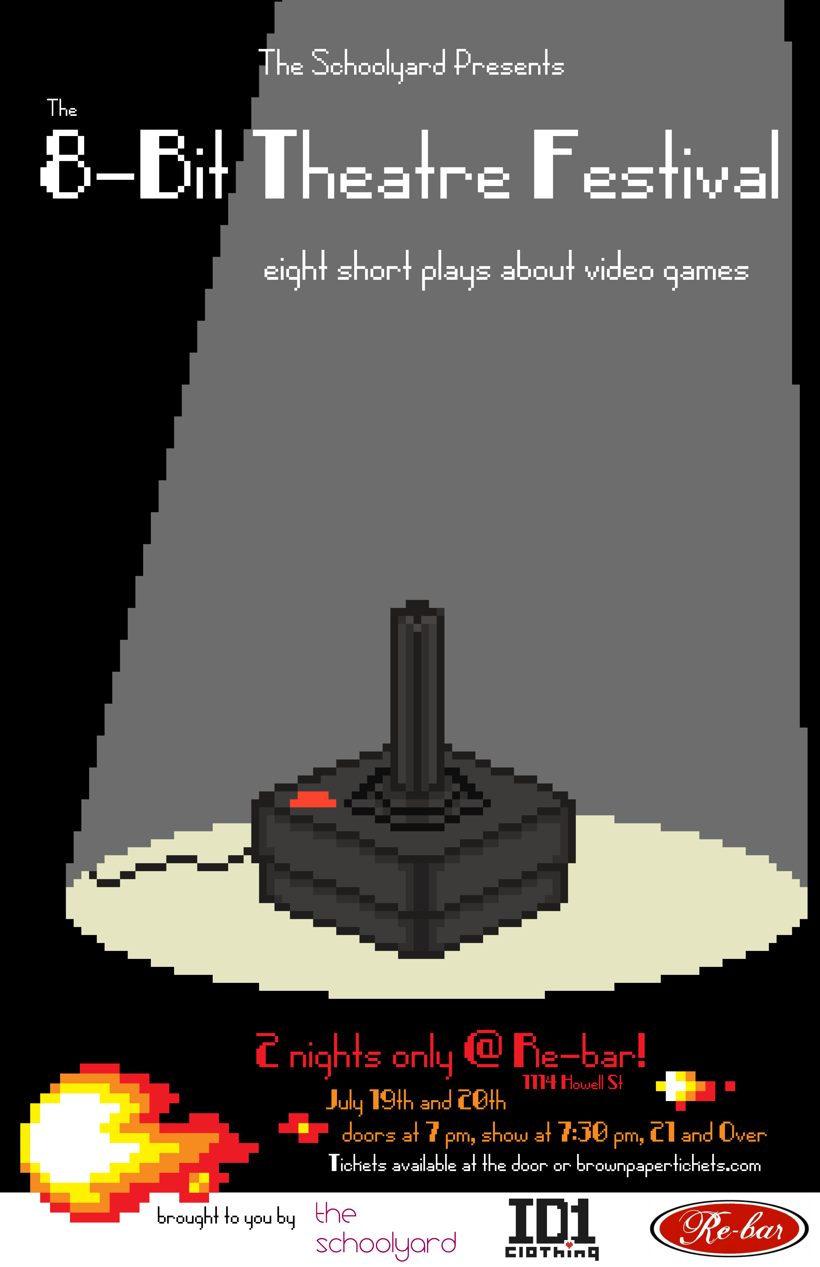
Poster
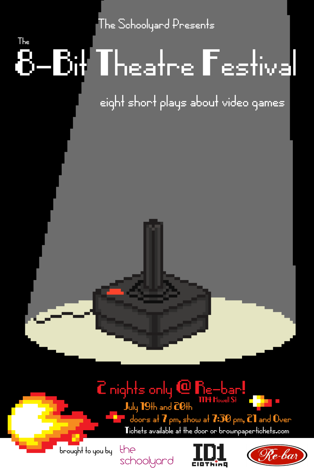
Flyer
Annex Theatre
Promotional
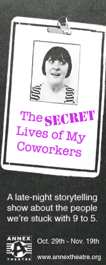
The Secret Lives of My Coworkers was a particularly fun project to promote. They needed a poster, print flyer, and banner ad. I love a good photo shoot and getting inventive. Improper use of a copy machine was the inspiration.
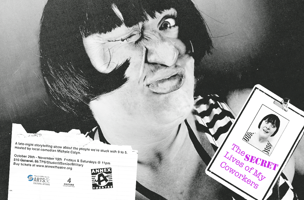
Poster
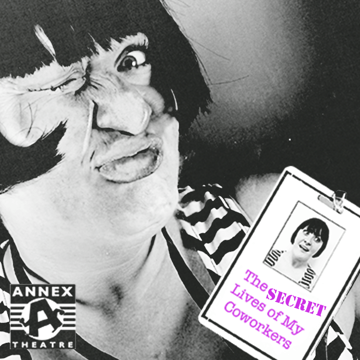
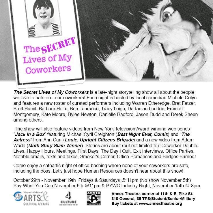
Two-Sided Flyer
Audio
Design Reel
I've also dabbled in audio production. Here are some examples of my musical creations and audio recordings. Enjoy!
Resume
Pass It On
Download my resume in PDF format. Thank you for checking out my portfolio.
